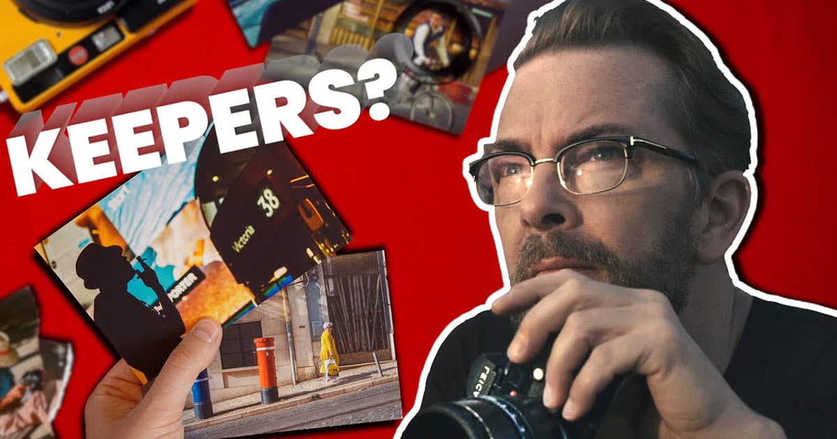
Street photography can speak to our souls. Taking images of common, everyday people and transforming them into art—that’s what it’s all about.
Street photography can be tricky to get right, though. I recently sat down with award-winning photographer Thorsten Overgaard for a street photography critique to explore what a good street photograph is made of.
Thorsten is a Danish photographer, writer, and educator on light and Leica. His images are striking in their simplicity and beauty (just look at his Instagram to see for yourself!).
All photography is subjective—some people will love an image and others will not. But there are principles and lessons that help all photographers take better images.
Photograph #1
The first photo is an image of the silhouette of a man who is smoking a cigarette. He’s positioned beside a double-decker bus and in front of some digital billboards.
Thorsten’s street photography critique:
He’s initially intrigued by the abstract photo and wonders what exactly it’s showing. It captures your attention with a strong atmosphere. After looking for a while, you realize it’s a picture of London, with the iconic image of a double-decker bus.
What he likes:
- The hat and cigarette go well together, making the man an interesting subject.
- The digital billboard provides visual interest without being distracting.
Room for improvement:
- This isn’t a negative point, but Thorsten points out that many people are sensitive to smoking in images and he often receives comments about it—just something to be aware of.
- Try the image as a black-and-white option and see if it adds to the atmosphere of the photo.
Photograph #2
The second photo of our street photography critique captures a man, who appears to be elderly, sitting by himself on a park bench. The background is fairly bare and you cannot immediately tell where he is. He’s wearing a hat that obstructs his face as he looks down at something in his hands.
Thorsten’s street photography critique:
This photo evokes an atmosphere of solitude. It’s relatable as you sit on a bench and write notes, read a book, or people-watch.
What he likes:
- You can immediately get into the atmosphere of the photo—it’s relatable.
- It’s a simple photo, where nothing “exciting” needs to happen for it to be interesting.
Room for improvement:
- Transform it to black-and-white to bring out more of the atmosphere.
- Take the photo from a lower angle and blur out the background a bit to make the subject stand out more.
Photograph #3
The third photo for Thorsten’s street photography critique is a snapshot of a person walking on a sidewalk near a commercial building. The person is framed by an opening in the building and they’re dark, nearly a silhouette.
Thorsten’s street photography critique:
This image feels like it needs some more work. The colors are not as vibrant as they should be to make an interesting photo. There is no obvious story or message when you look at the photo, so it doesn’t draw you in with intrigue.
What he likes:
- The idea is interesting because you can capture some interesting street life on the corner of the building. But you need to wait for an interesting message or story to capture. For this one, the subject just isn’t interesting enough and doesn’t tell a story.
Room for improvement:
- Work on drawing out the colors more. There is some red in the brick wall and sunshine in the photo that could be more vibrant through post-production editing. To keep this image in color, it would be important to bring out a contrast of warm and cool tones.
- If he couldn’t bring out the right colors, Thorsten would try the image in black and white.
Photograph #4
The last image for street photography critique captures a near-silhouette of a man looking out over some water. Over his face, you can see some reflections of other people, which makes it appear that the image is captured through glass.
Thorsten’s street photography critique:
This photo doesn’t immediately capture Thorsten’s imagination—it seems like a boring place and image. The way to add significance would be through a subtitle about where it is and who it’s capturing. Unfortunately, the story does not come through in the image itself.
What he likes:
- The silhouette and close-up image is a unique and striking composition.
Room for improvement:
- The image does not capture an interesting story; the subject and place both do not give an interesting message. To tell the full story, it requires a subtitle or description, as if it were in a newspaper.
3 Tips for Taking Great Photos
We can learn a lot from Thorsten’s street photography critique. When you are taking photos, whether candid street shots or otherwise, here are a few tips to keep in mind:
- Think about the story: What message are you sharing? What is the point of this image? You don’t need to explain or justify it as the photographer, but the viewer should feel something of importance when looking at it.
- Focus on the colors: If you choose to have a color photo, make sure they are vibrant and interesting. You can play around with warm or cool tones, or highlight one feature of the photograph. Color can also help set a mood or tone of an image.
- Try black and white: Changing from color to black and white can add interest to a photo. You should always try both out and decide which option helps share the message and story better.
Be sure to watch the full video at the top if you’d like to hear more of Thorsten’s critiques as well as learn more about street photography.
Street photography is an art, but it’s something you can keep practicing and get better at. Listening to Thorsten’s street photography critique gives us so many different tips and tricks to create the best image possible.
About the author: Martin Kaninsky is a photographer, reviewer, and YouTuber based in Prague, Czech Republic. The opinions expressed in this article are solely those of the author. Kaninsky runs the channels
Photography Critique and All About Street Photography. You can find more of his work on his website, Instagram, and YouTube channel.


