When I reviewed Microsoft Edge last year, I found its performance and experience unparalleled among peers like Google Chrome. But one concern prevented me from accepting that default browser pop-up, and I suspected it could be a fatal dealbreaker.
“On Edge, Microsoft constantly attempts to push you to use its in-house services,” I wrote and wondered whether Microsoft would get more aggressive once it claimed a larger piece of the browser market.
Over six months later, Microsoft has, unfortunately, proven me right. Since that review, Edge’s popularity has soared, but so has the amount of bloatware. In the last couple of updates, Microsoft has outfitted Edge with a range of spammy features. The browser now offers loans to users and allows them to split online payments into installments. It has a new price tracker, mini games, a math solver, a reviews aggregator, and more.
What’s worse, Microsoft has been actively abusing its Windows platform advantage to keep users from switching to other browsers. Not only is changing the default browser more complex and tedious than ever, but Microsoft force installed a ransomware-esque Windows update that launches a full-screen Edge ad users can’t skip or close. Microsoft was punished for pulling similar tricks decades ago with Internet Explorer, and I won’t be surprised if it comes under scrutiny again for its renewed browser ambitions.
The bottom line is Edge has become intolerable and is no longer the best Chrome alternative. It’s Vivaldi.
A browser that does everything
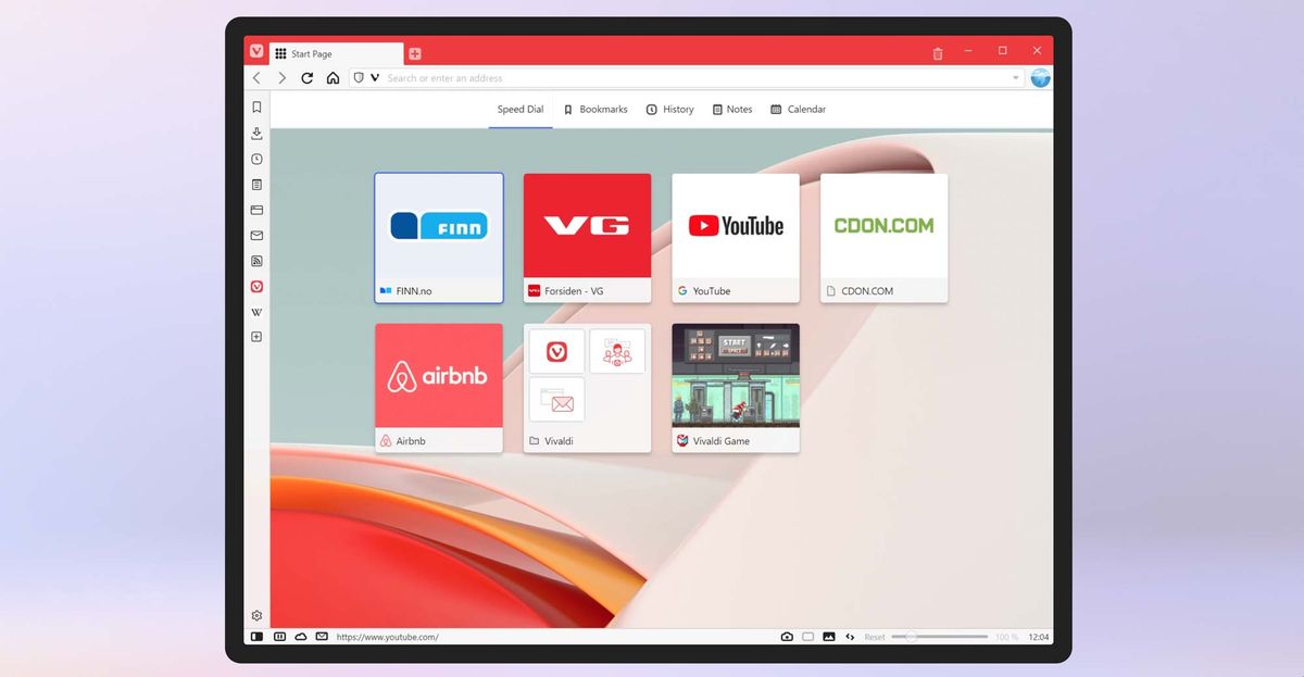
Vivaldi has always been the underdog and an offbeat alternative to more popular options like Brave and Edge. Of late, however, Vivaldi’s on an update spree that added a series of functions compelling me to give it a shot. And it turns out, it might be the Chromium browser to beat now that Edge is out of the picture.
Vivaldi’s biggest strength is that it’s a browser you can make your own. It offers the most versatile set of tools and options to fine-tune how the browser works and looks. Even after a week of use, I’m still discovering new functions every day. What’s more impressive is that it doesn’t make for an overwhelming first-time experience, or require a crash course to learn. Vivaldi strikes a balance between putting the features you need front and center and hiding the rest inside optional sidebars and menus.
What’s better than one row of tabs? Two rows
When you first fire up Vivaldi, it appears like any other web browser. But as you begin to operate it, you come across features that make it unique. Most browsers let you group tabs, for instance, but on Vivaldi, you can choose to nestle them in a way that works best for you and your device. You can stack them in a layout where you have two rows of tabs or clump them together in an expandable primary tab or on top of each other to save screen space. The ability to add another row of tabs is particularly clever if, like me, you often find organizing and keeping track of tab groups on other browsers clumsy.
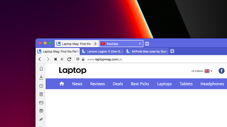
That’s not all. If you’re unsatisfied with Vivaldi’s default tab management despite the layout choices, you can further customize it to your preferences. You can switch between tabs by scrolling on your mouse, adjust their appearance, position the tab bar on any of the four sides, and more.
In addition to the address bar, Vivaldi houses a couple of sections you can personalize to fit your browsing style. There’s a sidebar on the left where, by default, you will find a host of mini apps, such as a calculator, an RSS reader, a window and tab manager, a calendar, a translator, and your history and downloads. You can also pin websites here like a messaging service’s web app and have a multi-window view. It sounds like a lot, but that’s where Vivaldi’s strengths kick in. You can hide this sidebar entirely or tweak it to eliminate any clutter and include only the panels you need.
Make your own browser themes
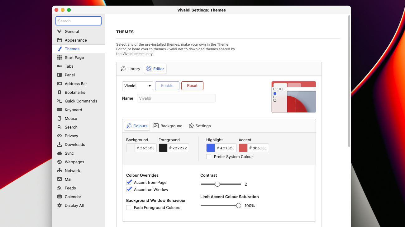
Like most browsers, Vivaldi comes with a catalog of themes you can pick from to switch up the colors of your tabs, accents, menus and more. What sets Vivaldi apart, though, is its built-in editor that lets you modify these themes down to the last pixel, or build one from scratch. Or you can leave it to its default look like me, which itself is quite clean, and automatically adapts to your current web page’s dominant color. If you’ve got Philips Hue lights, Vivaldi can control those too as you browse the web.
Though Vivaldi’s personalization prowess got me initially interested in it, its advanced suite of productivity tools convinced me to stay. The most important of them all is the search function that allows you to look up anything on the browser, including your tabs, history, notes, and more, in an instant. You can also compress a chain of actions into a single command and automate your most frequently accessed workflows. For instance, I created a command chain for the websites I launch as soon as I log into my computer.
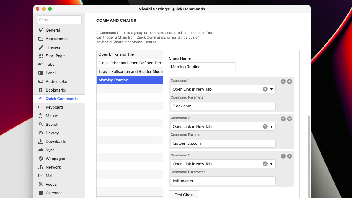
Vivaldi also takes keyboard shortcuts up a notch and offers mouse gestures. So instead of pressing “Cmd/Ctrl + T” to open a new tab, you can hold down your mouse’s right key and move it down. I wasn’t originally sold on this, but after a few days, I found that it’s far quicker once you get the hang of it.
No more dealing with cookie pop-ups
Like most browsers, Vivaldi is equipped with the usual privacy trappings. It can protect your identity from trackers, block third-party cookies and malicious crypto mining sites. Plus, it can save you the trouble of going through those cookie pop-ups by rejecting them automatically for you.
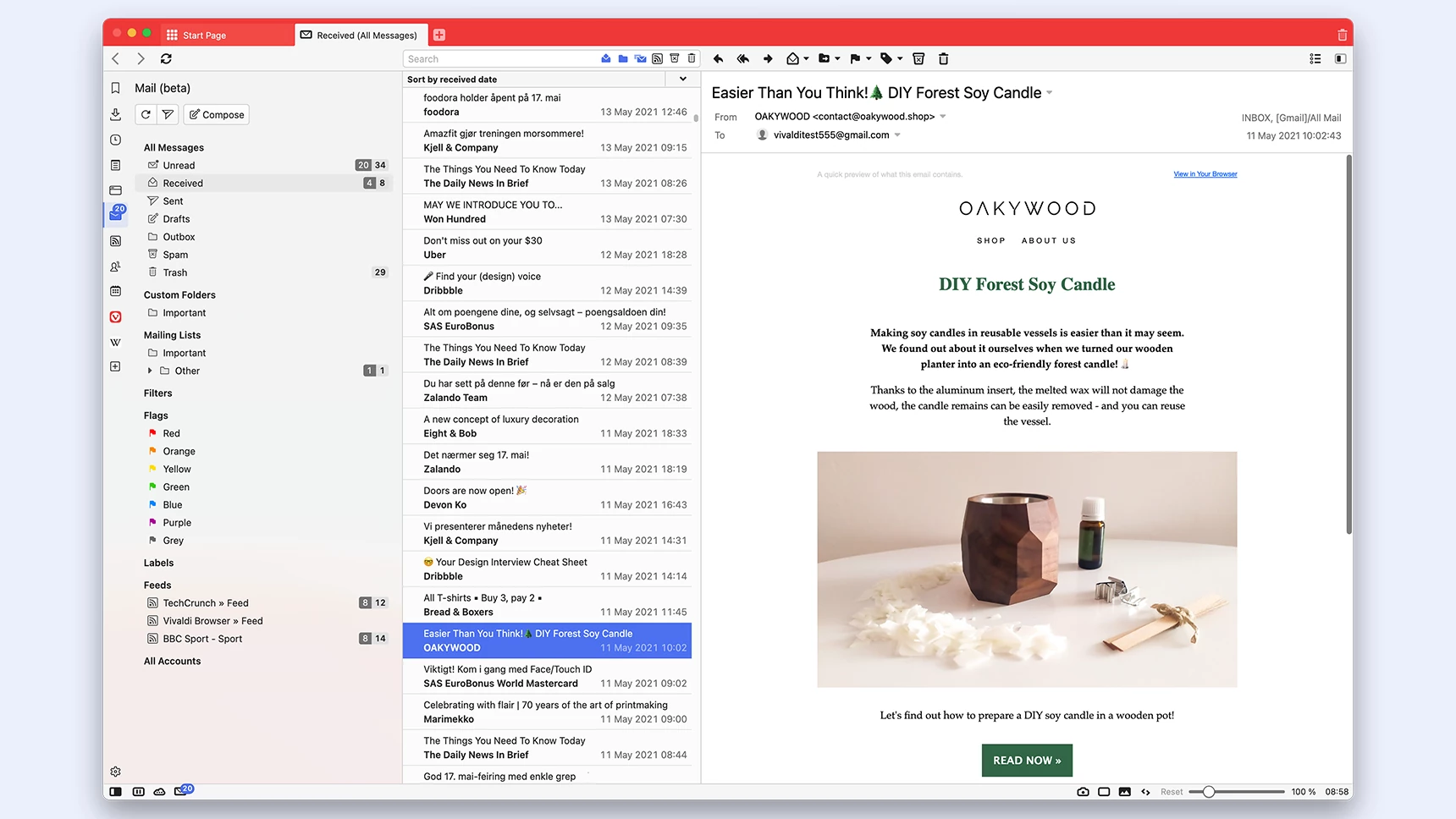
For people who are looking to escape Big Tech altogether, Vivaldi recently added its in-house mail and calendar clients. You can either plug in third-party services, such as Gmail and Outlook or sign up for Vivaldi’s privacy-focused alternatives. These apps feature just about everything you’d expect, including offline support. If you spend most of your time in the browser, this integration can come in especially handy as you can quickly access your inbox and appointments from the sidebar or the status bar at the bottom.
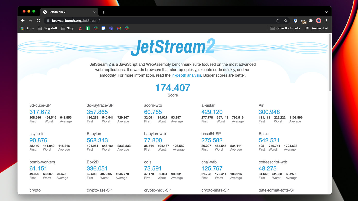
Since Vivaldi is based on the same engine as Chrome, it supports extensions from the Chrome Web Store. That perk also allows it to go toe-to-toe with its peers in performance. On my M1 MacBook, Vivaldi didn’t stutter once rendering a page, irrespective of dozens of active tabs and windows and consumed at least 20% less memory than Microsoft Edge. Benchmark results back this up too. On the JetStream 2 test, Vivaldi (177.4) scored a couple of points higher than Microsoft Edge (171.9) and Google Chrome (174.4).
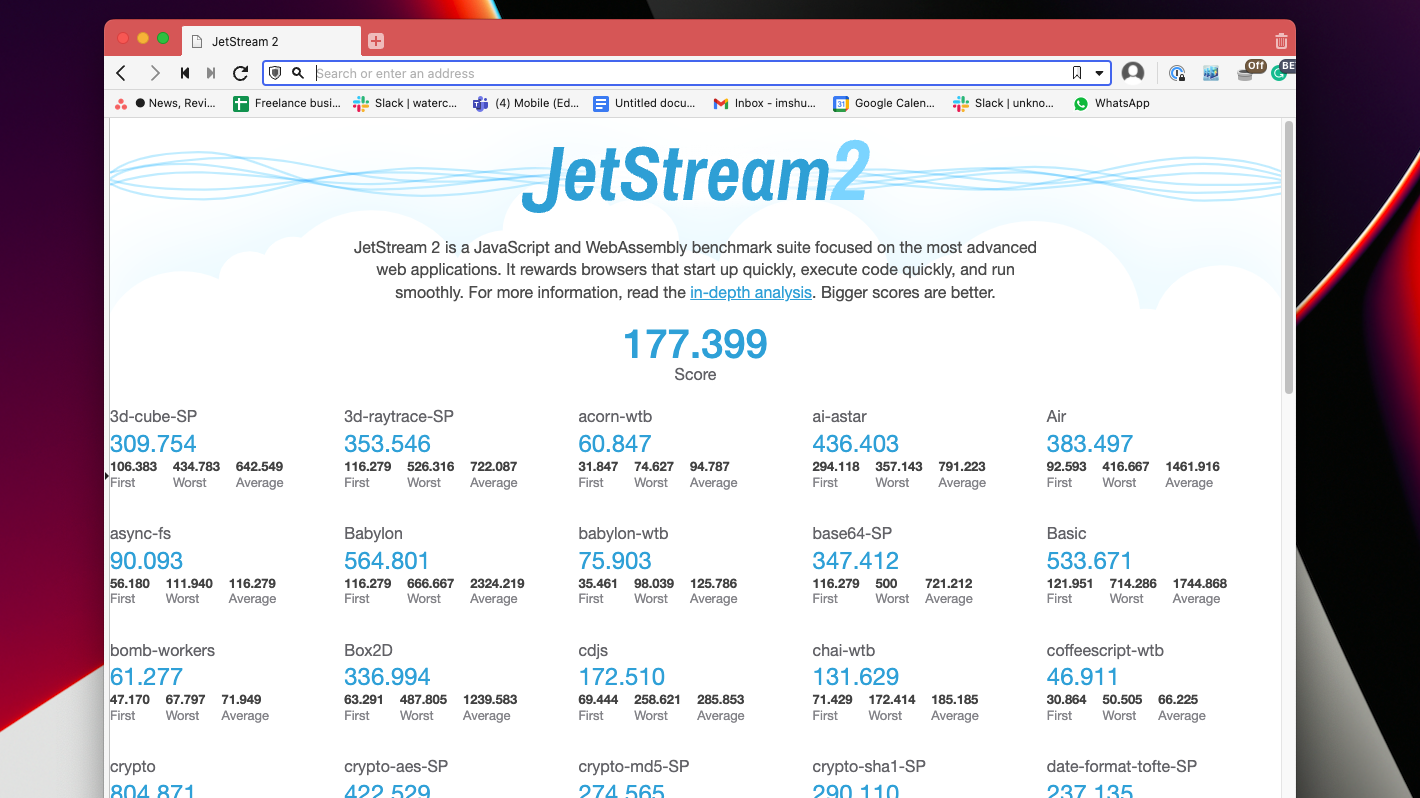
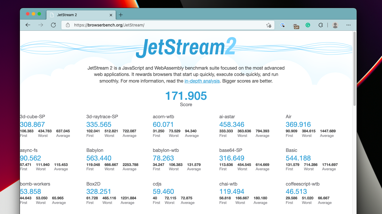
For me, Vivaldi’s only downside is that it’s not available on iOS and iPadOS. So if you’d like to sync your browsing data and don’t have an Android phone, you’re out of luck. Vivaldi has previously stated it plans to build an iPhone client sometime in the future, but it might take a while since Apple requires all third-party browsers to rewrite their code with the Webkit engine.
Conclusion: should you switch to Vivaldi?
Vivaldi has come a long way, and its latest version certainly hits all the right notes to take up the mantle for the best Chromium browser from Edge. It’s neither under the control of a tech giant, such as Microsoft and Google, nor trying to stand out with ambitious features like Brave’s crypto-focused platform. It’s a browser designed for power web users and has no ulterior motives. So if you’ve been looking for a Chromium browser that does it all and does it in a practical manner — minus the fanfare, Vivaldi is your best bet.

